


The Illustrator Confesses All
How he does it

“They’re quite conceptual: the Lunn’s Ford Zephyr motoring along with Fred’s pith helmet sitting on top, Jim as a Matryoshka doll, and my favourite: the busy Lunn dining room table, annotated with place names.”
By David Mackintosh
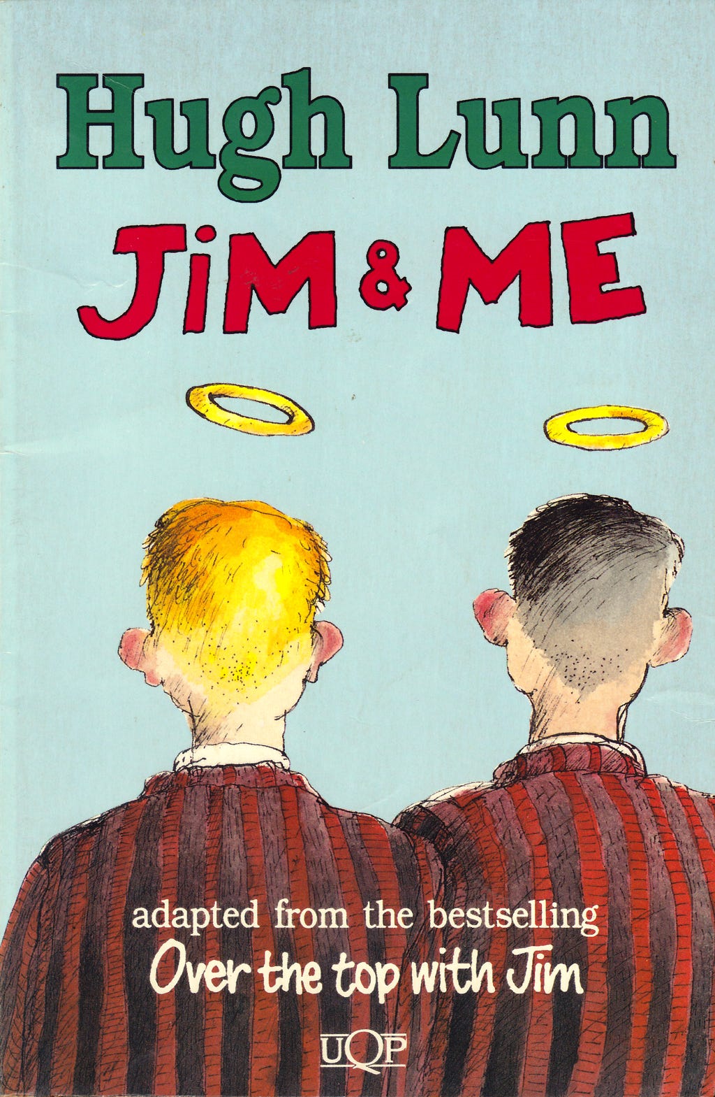
My first job for University of Queensland Press was to illustrate the cover of the children’s edition of Hugh’s Over the Top with Jim, called Jim and Me.
The children’s editor, Clare Forster, called me in for an interview where I showed my work in a shiny new portfolio because I was fresh out of university.
As I sat in her office in a shirt and a pair of shorts, as is customary for Brisbane in summer, it suddenly occurred to me that I wasn’t appropriately dressed for a job interview and that I had a snowflake’s chance of getting employed by this outfit – because of my outfit.
But it wasn’t to be.
I remember reading the manuscript of Jim and Me on the bus on the way home from UQP. It made me laugh. I liked the insight into a Brisbane only a few decades before my living memory of it in the seventies.
It was all kind of familiar.
I knew all the place names (I grew up on the southside too), but it was strangely different and uncomplicated, if that was possible. I was intrigued by the big Catholic family who ran a cakeshop and the wildcard of Jim, the clever Russian new-settler (via China), at ease in his sub-tropical surroundings.
Sometime after this, I met Craig Munro in his office, or perhaps in the busy production department run by Terry Farley, downstairs at the Press.
Craig asked if I’d like to do the cover and some chapter illustrations for some short stories that Hugh had written about his parents. The collection would be called Fred and Olive’s Blessed Lino.
“At least it will be once I convince Hugh,” Craig Munro smiled.

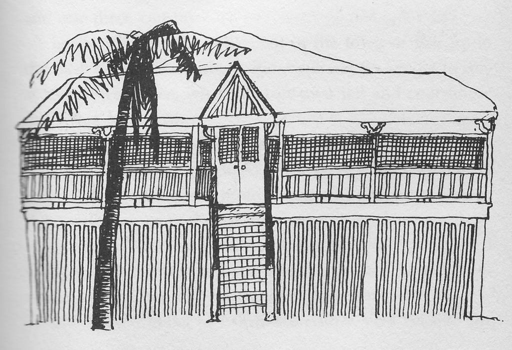
With Jim and Me, I liked the simple honesty of the stories and I wanted these drawings to reflect that too: they are loose line drawings in pen and ink which I drew on A4 bond paper. I wanted them to be fast, simple, and immediate so I did them with little preparation, drawing directly in ink and if I made a mistake, I’d grab a fresh sheet of paper and try again (or use liquid paper).
Once I got a drawing I liked, I’d keep it. I went through a lot of paper this way, but photocopy paper was cheap, and I drew on the other side of the rejects.
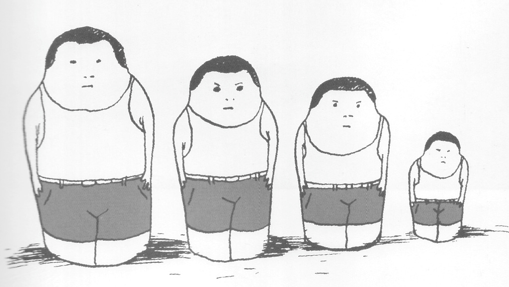
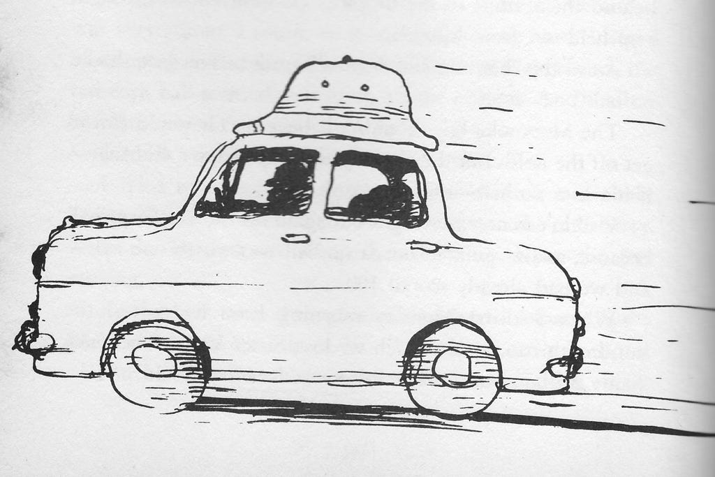
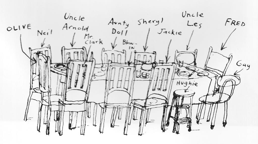
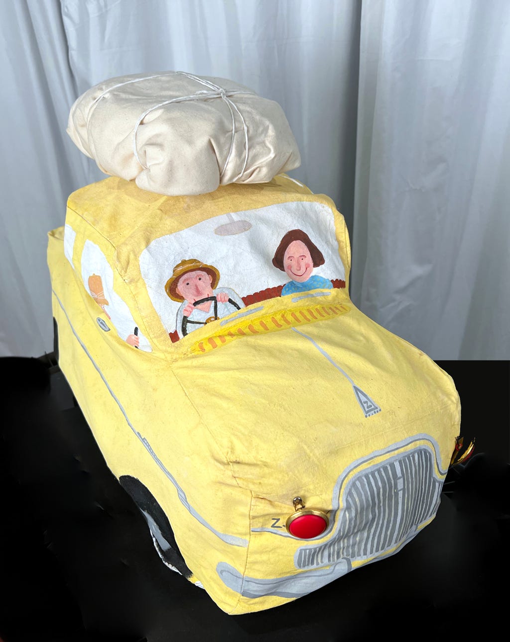
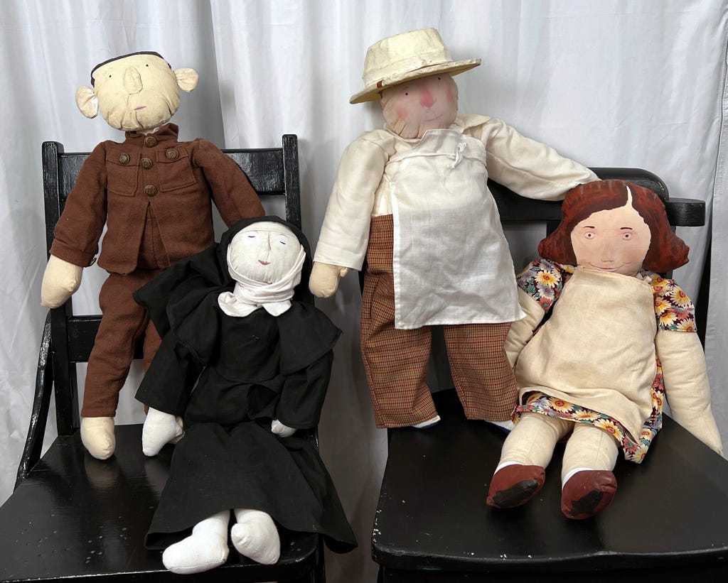
They’re quite conceptual: the Lunn’s Ford Zephyr motoring along with Fred’s pith helmet sitting on top, Jim as a Matryoshka doll, and my favourite: the busy Lunn dining room table, annotated with place names.
I met Hugh and Helen before I started this book. I think it was at a cafe near their home in St Lucia. Hugh was full of beans, eager to answer any questions I might have about the inhabitants of the stories.
I remember it was too much to take in over two cappuccinos: we were talking about a whole childhood after all. But I enjoyed the luxury of meeting the author, which isn’t always possible when you’re the illustrator. I recall sending all the drawings off to Craig Munro (in the post) and getting notes from Craig, Hugh and Helen in due course.
Some drawings were dropped, others celebrated, and it was mostly these that made it into the book.
It was that simple.
When the Over the Top with Jim Album came about, it was one of the first books I’d done entirely digitally i.e. delivering digital files to a printer. The book relied on regular meetings with Hugh and Helen at the University of Queensland Press…we were generously allocated a room outside Craig Munro’s office to work in.
We used waxed cardboard mango boxes (they’re virtually indestructible) to arrange the original content for each chapter: news clippings, photographic prints, family photos, objects that had to be photographed, and notes made by Helen on pieces of paper and sticky notes as reminders of what belonged where and what had yet to be sourced by Hugh.
I used my ever-expanding collection of vintage magazines and books from the fifties (and sixties) as source material for graphics used in the book. I cut up a lot of my favourite pristine magazines, but it was the only way. At some point I sold this yellowing collection to someone for fifty bucks.
He picked them up from my house in an HD Holden station wagon, sight unseen.
Hugh and Helen's journalistic precision was reassuring and I learned a lot working with them. It was easy to spend scarce time listening to explanations of people and places, and walking down memory lane with Hugh, but that’s what this book was all about after all.
We would often repair to the new cafe attached to the bookshop to discuss details while my old Apple LC630 ground a backup of the latest chapter onto a SyQuest drive.
Working with authors and editors is different with every project, and I was extremely lucky to have had such a happy experience by working with Hugh, Helen and Craig so early in my career.

Illustrations Copyright profuselyillustrated.com
As a rusted on fan, we are fortunate that Craig could convince Hugh regarding the collection and subsequently the gifted illustrations by David. It is amazing how clever loose line drawings in pen add depth to an already cherished story.
David, the mechanics of organising an illustrated book had never occurred to me. Thank goodness you can do all the practical bits, otherwise we'd never get to see your joyous whimsy. Your drawings linger in my mind, a cheery comfort.